Emma was a dedicated employee at a health resources company that supported clinics and hospitals across the region. Her job was to manage patient records, ensure accurate data entry, and assist providers with accessing critical information. She loved her role because it felt meaningful—she was contributing to better healthcare. But there was one glaring problem: the outdated EHR software.
The system was clunky, slow, and prone to glitches. Every morning, Emma braced herself for the daily ritual of waiting for the software to load. What should have taken seconds often dragged into minutes, leaving her staring at a spinning wheel. Simple tasks, like searching for a patient's history or confirming their insurance, became exercises in patience.
Navigating the system was like walking through a maze. The interface was confusing, and the steep learning curve didn't help either. New employees frequently needed weeks of training to understand the system, and even then, mistakes were common. She often imagined how transformative her job could be if she could work with updated, efficient EHR software.

Project Summary
Company: Trillium Health Resources
Responsibilities
- UI/UX redesign (80%)
- Design System extension (20%)
Team
- 1 UI/UX Designer (me)
- 5 Developers
- 1 Architect
- 1 QA Engineer
- 1 Project Manager
- 1 Team Leader
Timeline
Ongoing project: July, 2024 December, 2025
Results
- Improved user experience
- Increased employee satisfaction
- Reduced administrative overhead
- Positive impact on patient care
- Enhanced efficiency
Testimonial
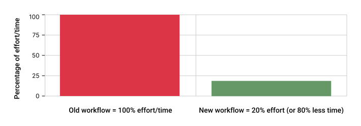
The redesign of TBS allowed me to improve my data entry workflow by 80%. It gave me back 2 hours of my day!
Aaran G. –MH/SU UM Clinician, Trillium Health Resources
Improvement
Redesigned App Using UX/UI and Design System Expertise, Overcame Lack of Documentation, and Identified UI Issues from Merged Codebases
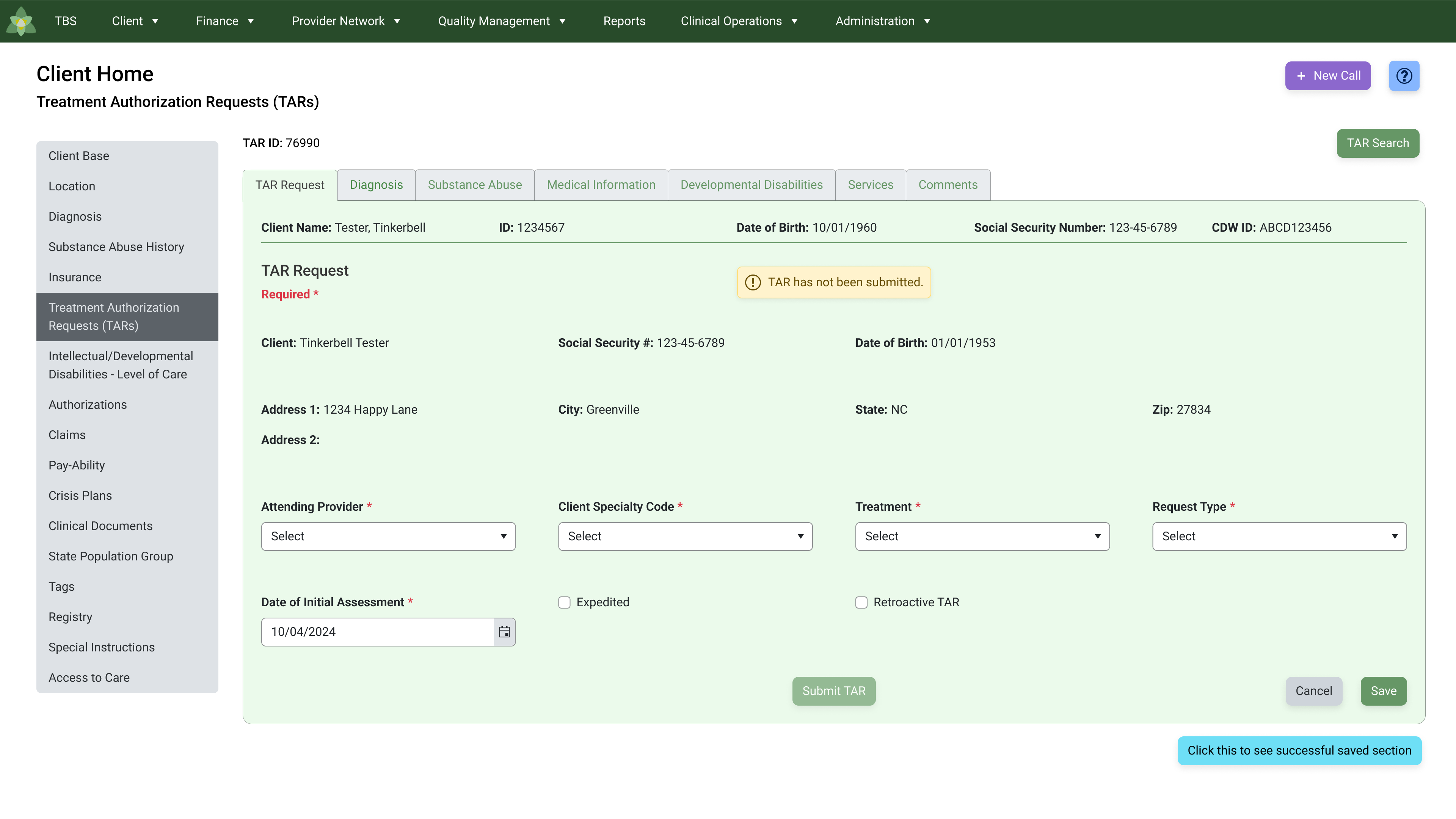
Part of the redesign
The Case for Redesign
While staff were committed to providing excellent patient care, the outdated EHR system created daily friction. What should have been quick, seamless tasks often turned into time-consuming, error-prone workflows. Redesigning the EHR app became critical to improve both employee experience and patient outcomes.
- Performance bottlenecks: Slow load times and frequent glitches.
- Inefficient workflows: Routine tasks required excessive effort.
- Poor usability: Confusing navigation felt like a maze.
- Training burden: Weeks of onboarding and frequent errors.
- Employee morale: Outdated tools caused frustration and burnout.
- Patient care impact: Delays cascaded into slower care delivery.
- Competitiveness: Risk of falling behind organizations with modern systems.
Usability Issues and Inconsistent Design
The application suffered from multiple usability and consistency problems that hindered the user experience. Navigation was often confusing, and critical user flows needed refinement to reduce friction. Validation messages lacked consistency, while sections and tables were missing clear labels. Poor table layouts and overly busy pages further complicated interactions, and overall, the app presented an inconsistent visual and functional design.
- Navigation challenges
- User flows needed improvement
- Inconsistent validation messages
- Lack of labels for sections and tables
- Poor table design
- Overly busy pages
- Inconsistent design across the app
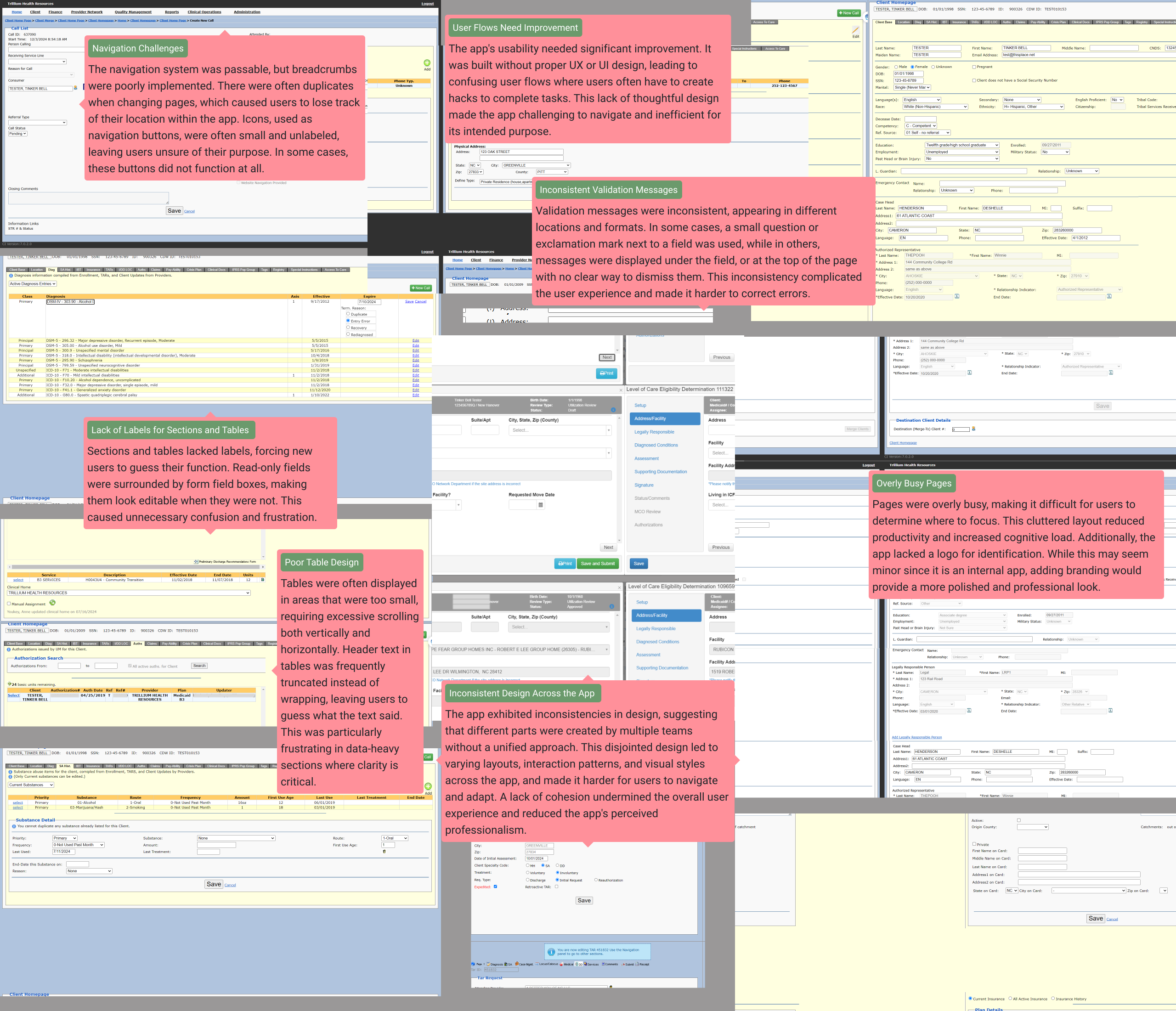
Examples of Trillium's app
Streamlining UI Design with Inspiration from Healthcare Apps and Telerik's Figma UI Kit
I partnered with business stakeholders to capture needs and translate them into a section-by-section redesign. In parallel, I enhanced the existing UI kit to align with the codebase the developers were using and applied it across the new designs for consistency and speed. Our five developers built each section from my specs, the architect ensured the pieces worked seamlessly together, QA verified each build against my designs and specifications, and our project manager kept us on schedule.
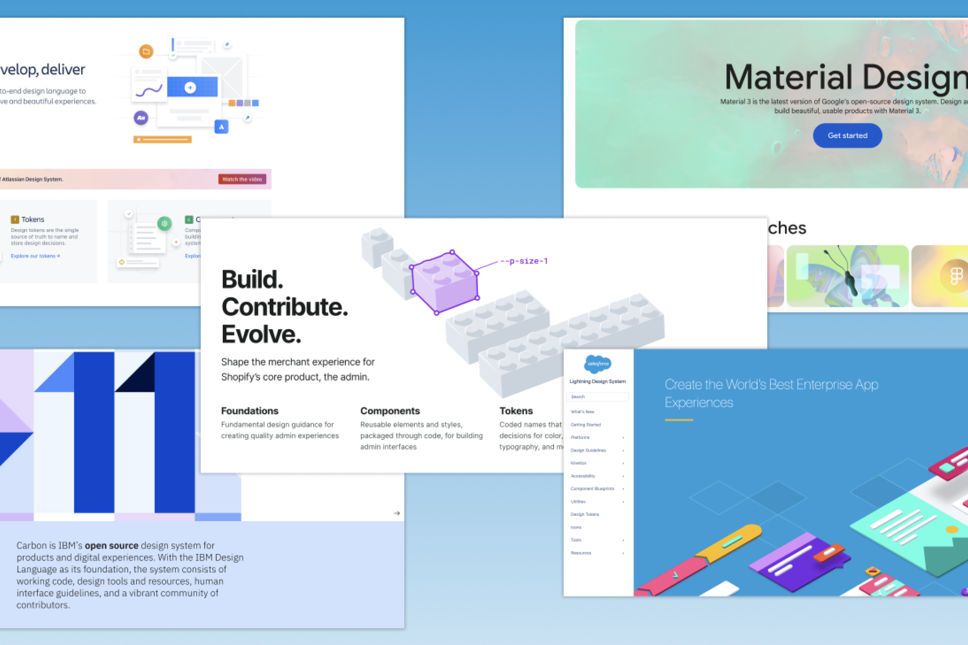
I drew my UI design inspiration from modern healthcare apps, which often feature blue or green color schemes along with ample white space. The developers were already leveraging Telerik's Blazor code and Bootstrap for the app's development. Telerik offers helpful components, code, documentation, a design system, and Figma UI kits. After consulting with the developers, I opted to use the Telerik Figma UI kit that was based on Bootstrap, ensuring alignment with their existing workflow and avoiding the need to start from scratch.
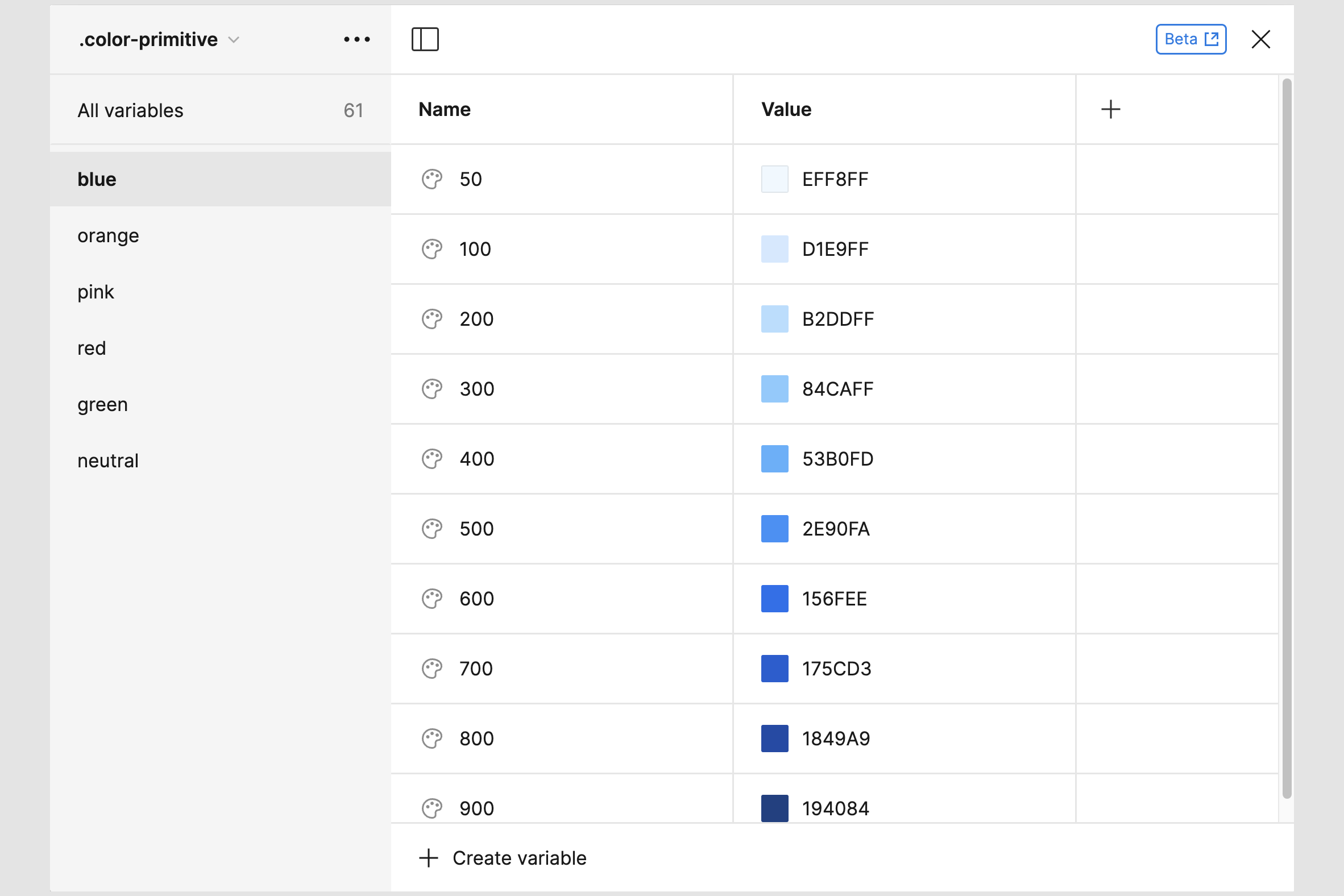
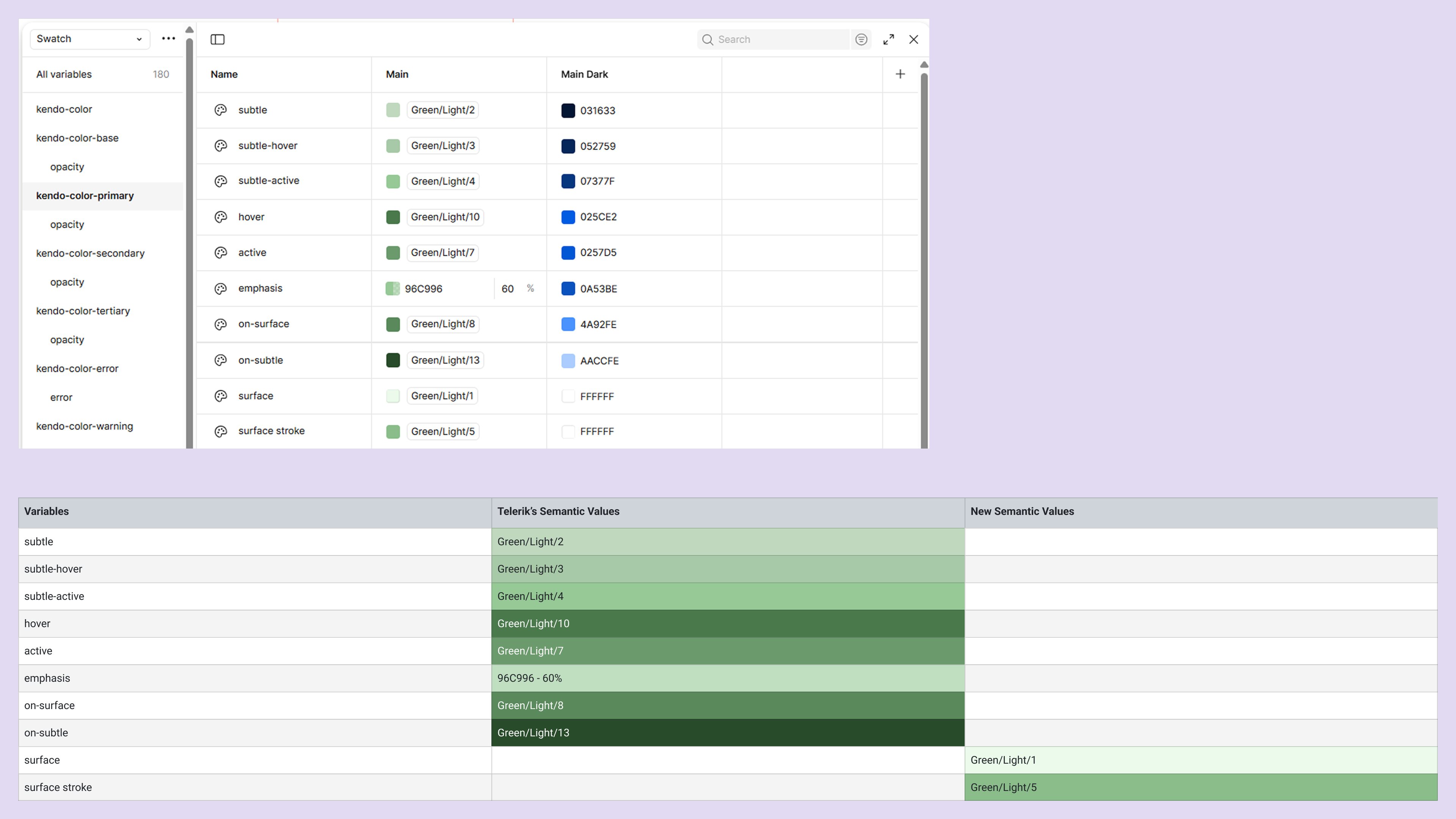
To keep design-to-code parity, I extended the Kendo (Telerik) token set with product-specific semantic tokens and had the app consume them as CSS variables. Base tokens (e.g., --kendo-font-family, --kendo-color-text) control global typography and text color, while custom tokens (e.g., --custom-primary-content-container-surface, --custom-primary-content-container-stroke) standardize content container colors across every page. Because components read from tokens, a single change cascades across tooltips, fields, and validation patterns—improving consistency, accessibility, and delivery speed.
See an example of the tokens at work.
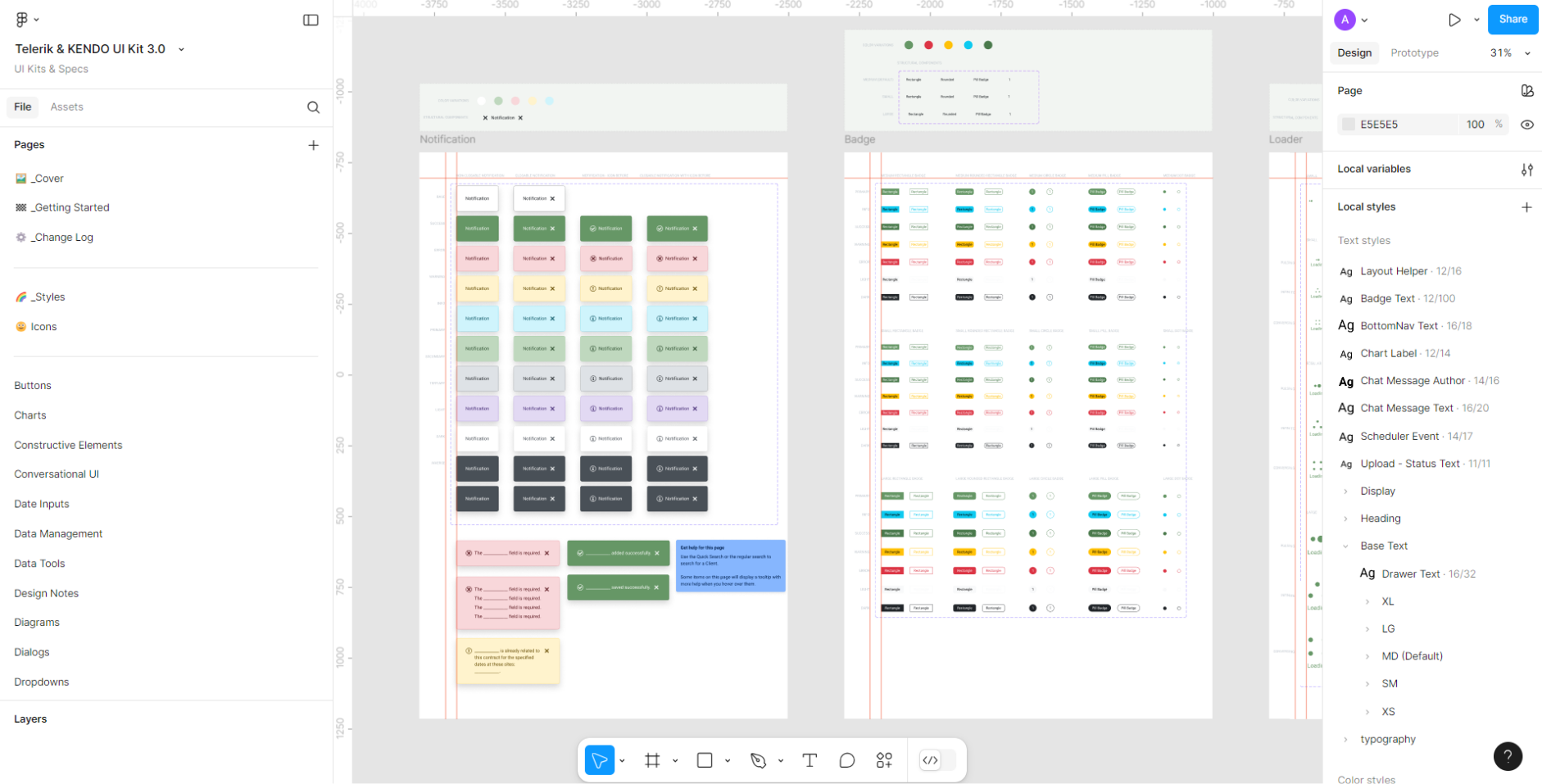
Telerik's UI kit
Aligning App Design with Business Goals Through Collaboration and Iterative Refinement
Throughout the project, I worked closely with stakeholders to ensure every page of this section aligned with business needs. It began with a series of initial meetings where we gathered requirements and clarified goals. With a clear vision in mind, I moved to design, creating detailed mockups and interactive prototypes in Figma for stakeholders to review.
Once the initial designs were ready, we reconvened to validate them, making sure they met expectations and captured the intended functionality. Feedback from these sessions guided me as I refined the designs to better align with the business's objectives.
In the final review meeting, I included the assigned developer to ensure a smooth transition. After securing approval, the developers implemented the designs, and we conducted thorough testing with business representatives, developers, and IT staff. This collaborative effort ensured that every aspect worked seamlessly and met the high standards we set out to achieve.

My process
Overcoming Design and Implementation Challenges in a Complex, Undocumented App Environment
The project came with its fair share of challenges, starting with a steep learning curve for me due to the lack of documentation on how the app functioned. Adding to the difficulty, many elements within the app were not labeled or were labeled poorly, which made it harder to understand its structure and functionality.
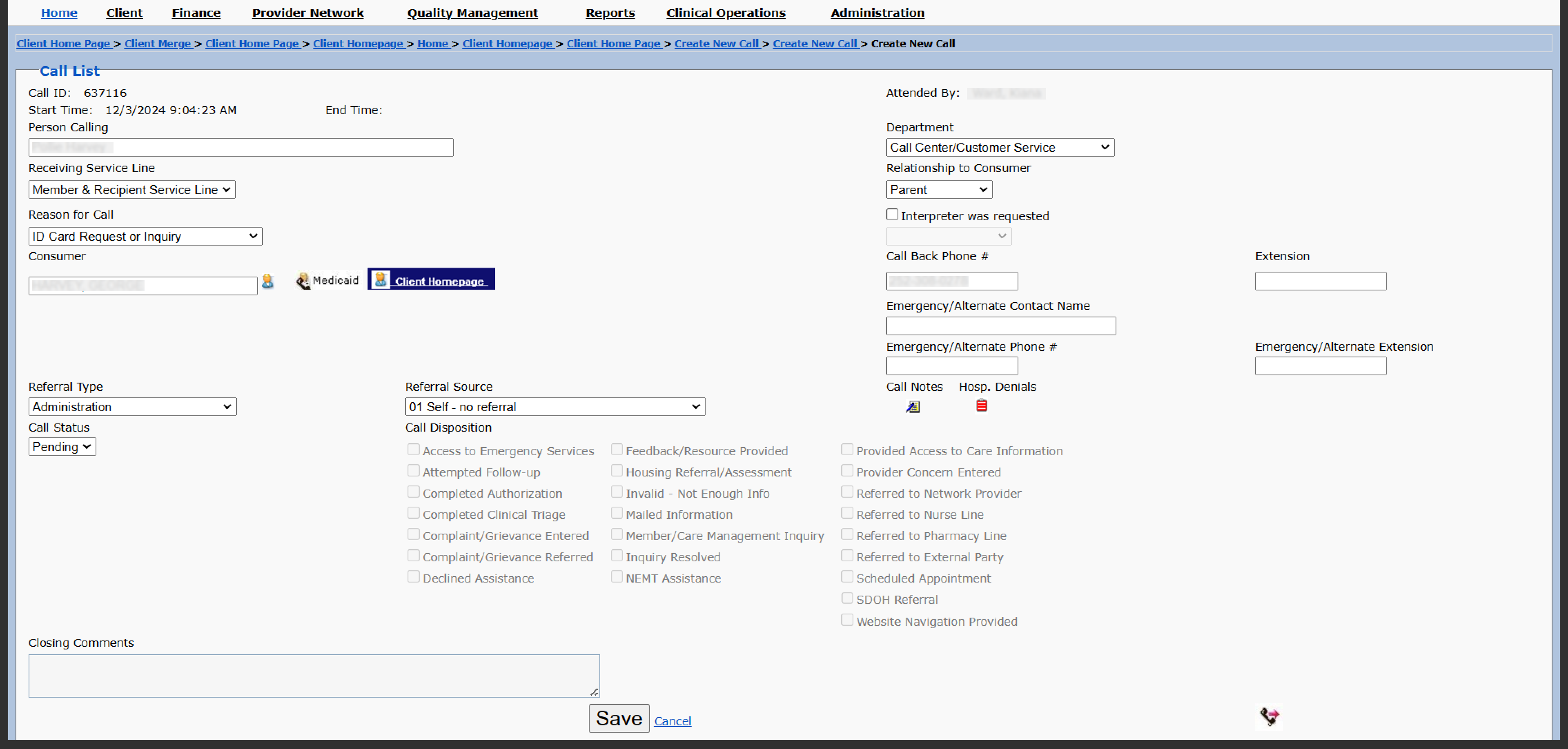
An example of poorly named elements and lack of organization
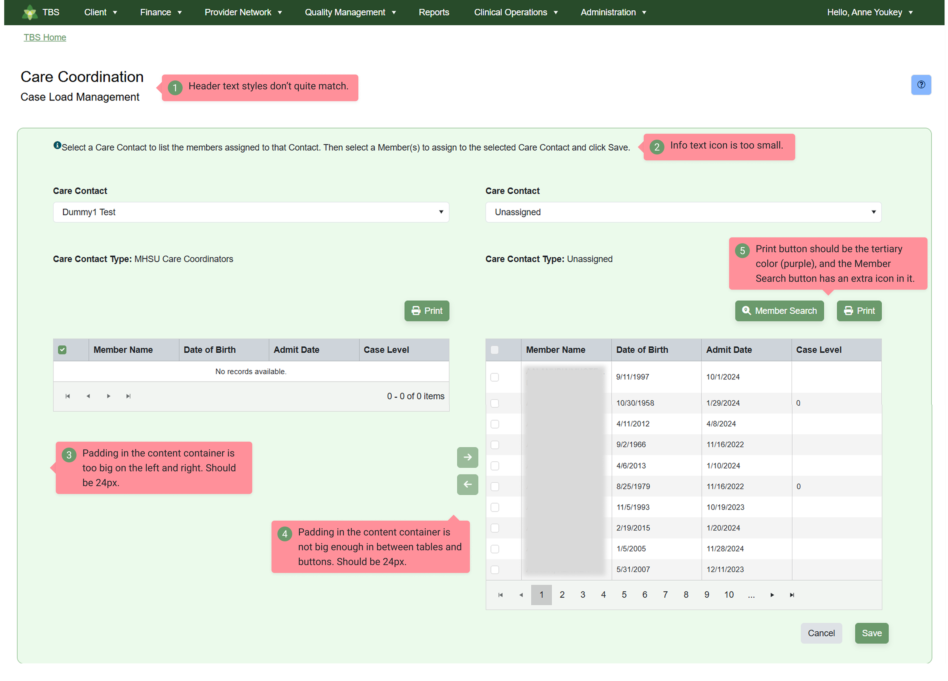
Another hurdle arose after the developers began implementing the designs. I discovered that they were working with an outdated version of Telerik's codebase and their own code, which introduced unexpected design issues. To address this, I meticulously reviewed the implemented designs and compiled a detailed spreadsheet of UI design issues that needed correction. The project manager, QA, and I also started meeting bi-weekly to document what needed to be fixed.
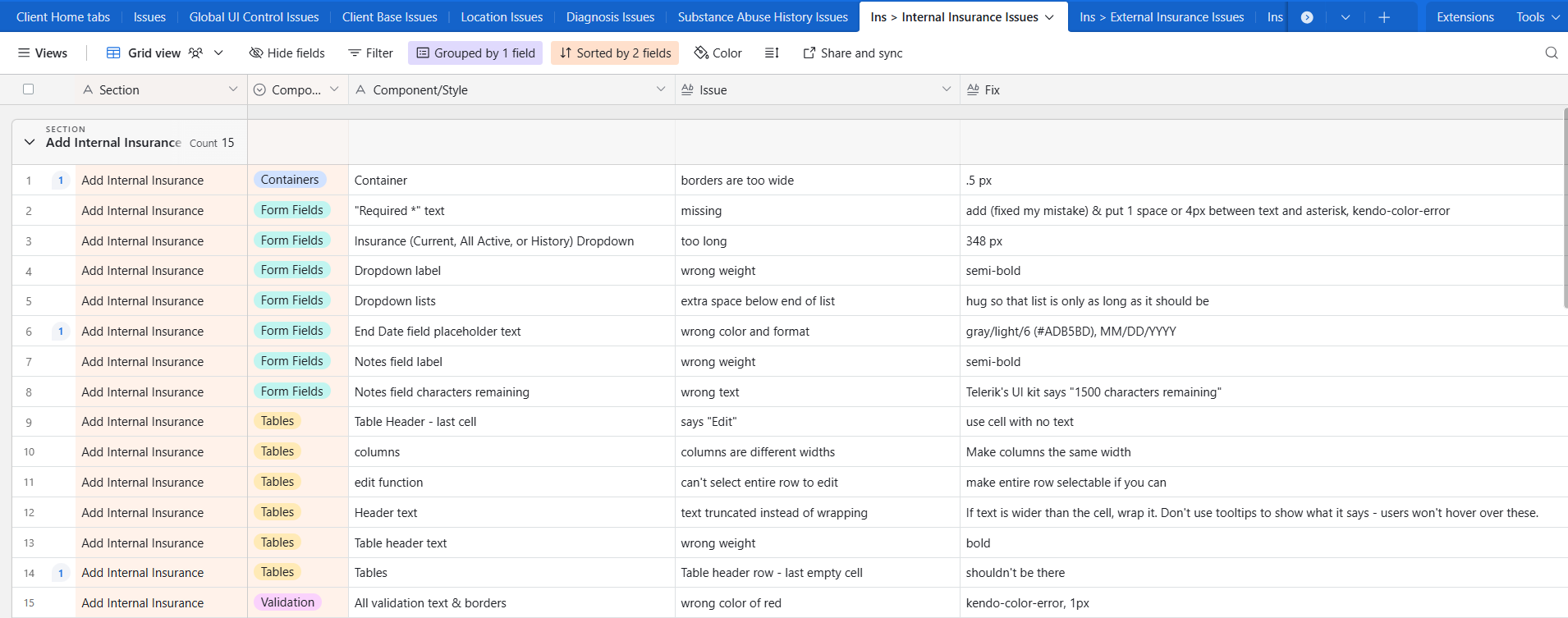
Part of the spreadsheet of UI design implementation issues
Additionally, while some developers had access to Figma's dev mode, I initially overlooked including spacing specifications in my designs. This oversight caused confusion and required adjustments during implementation, as developers had to make assumptions about spacing and padding specs. These challenges ultimately taught me valuable lessons about preparation, communication, and the importance of thorough documentation in design workflows.
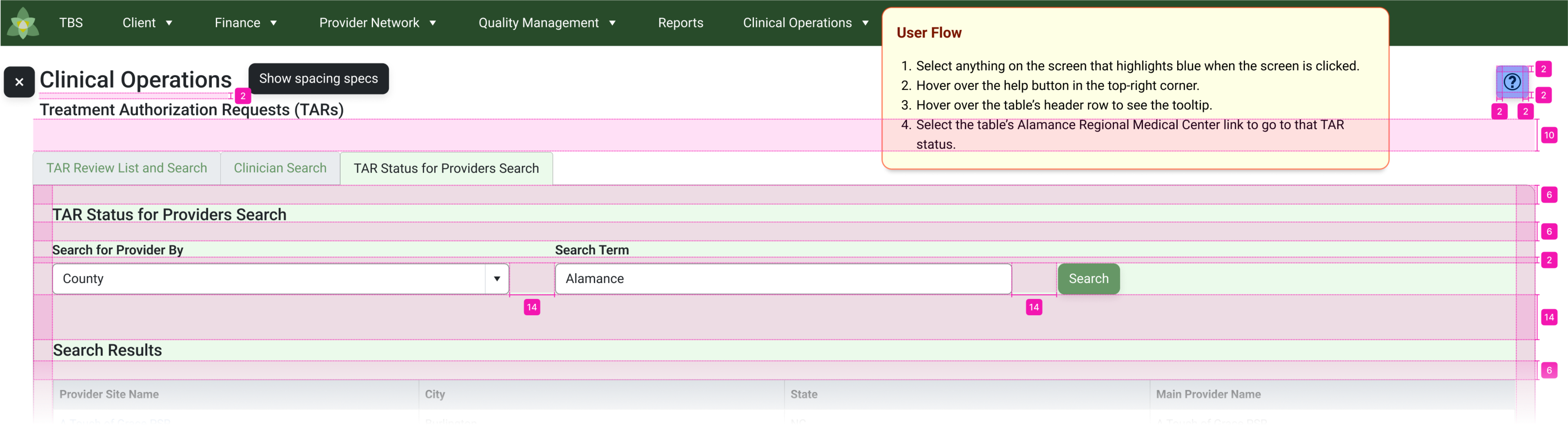
Spacing specs for developers became part of my mockups and could be shown with a click of a button
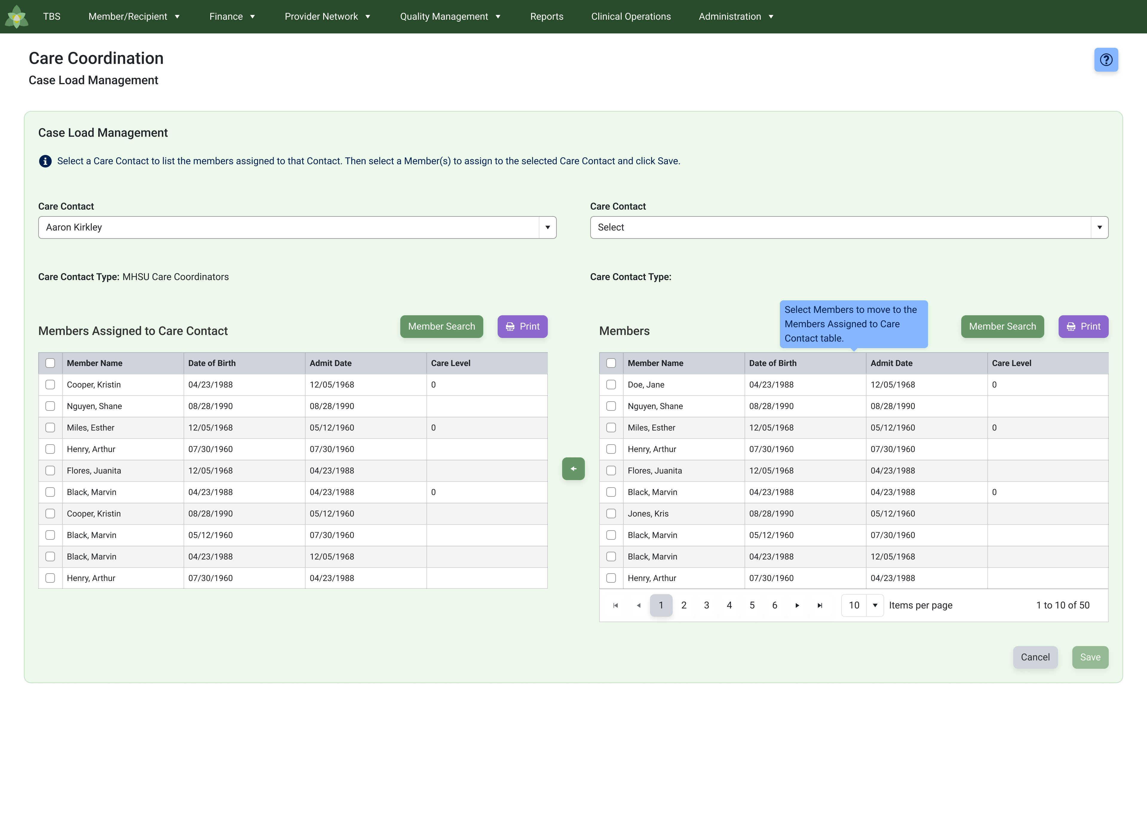
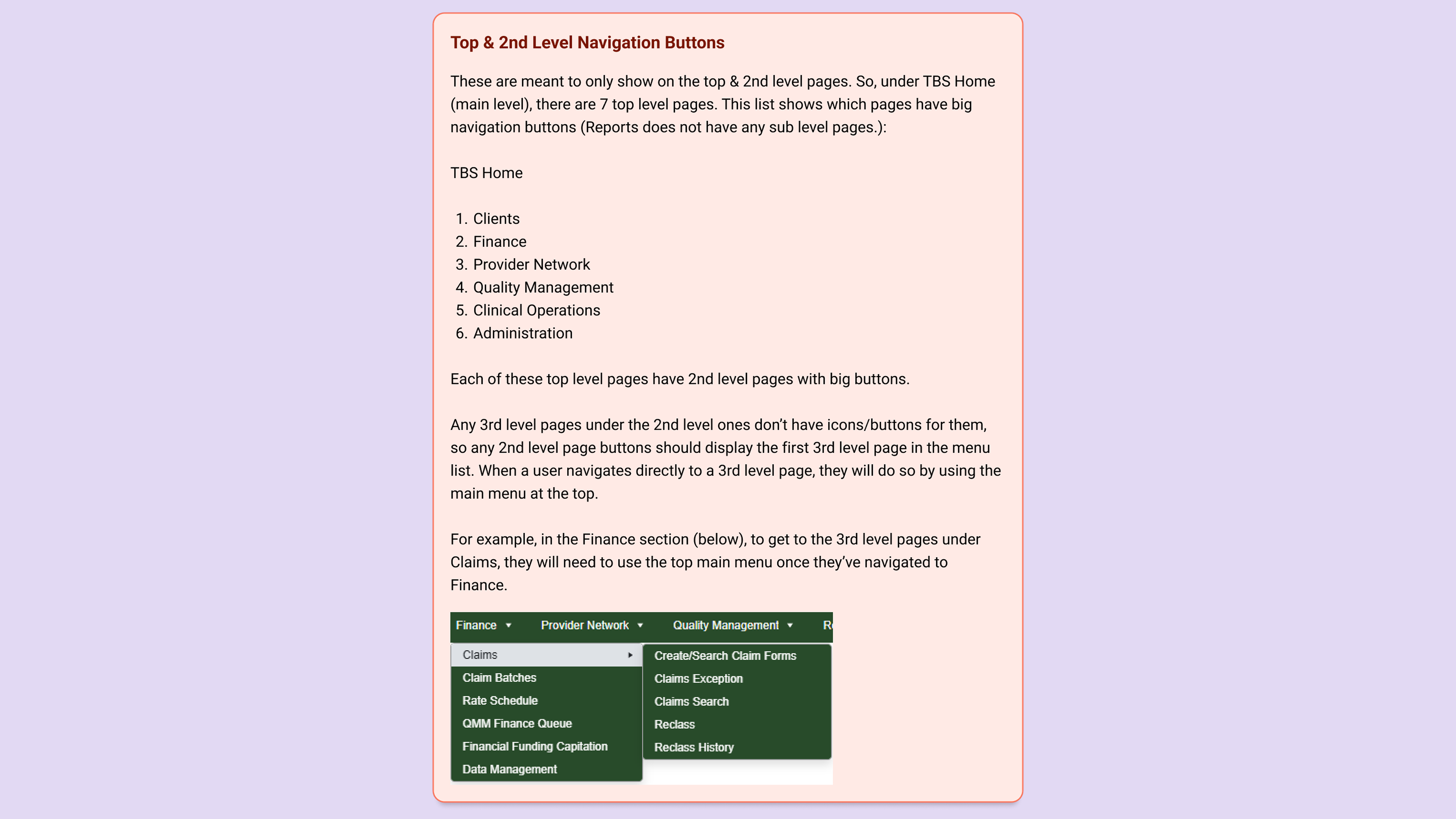
Streamlining Navigation and Enhancing Usability for Better Workflow
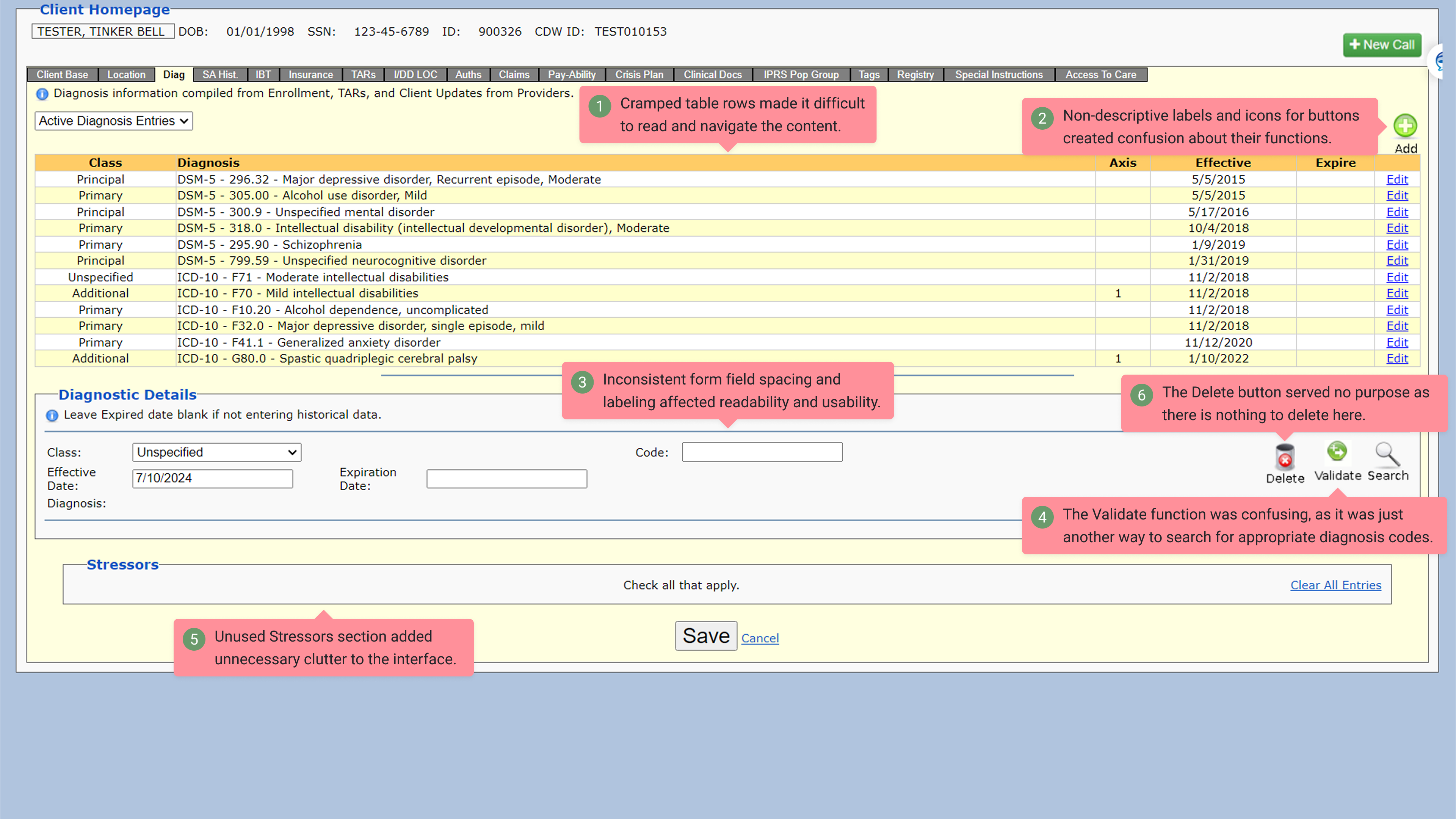
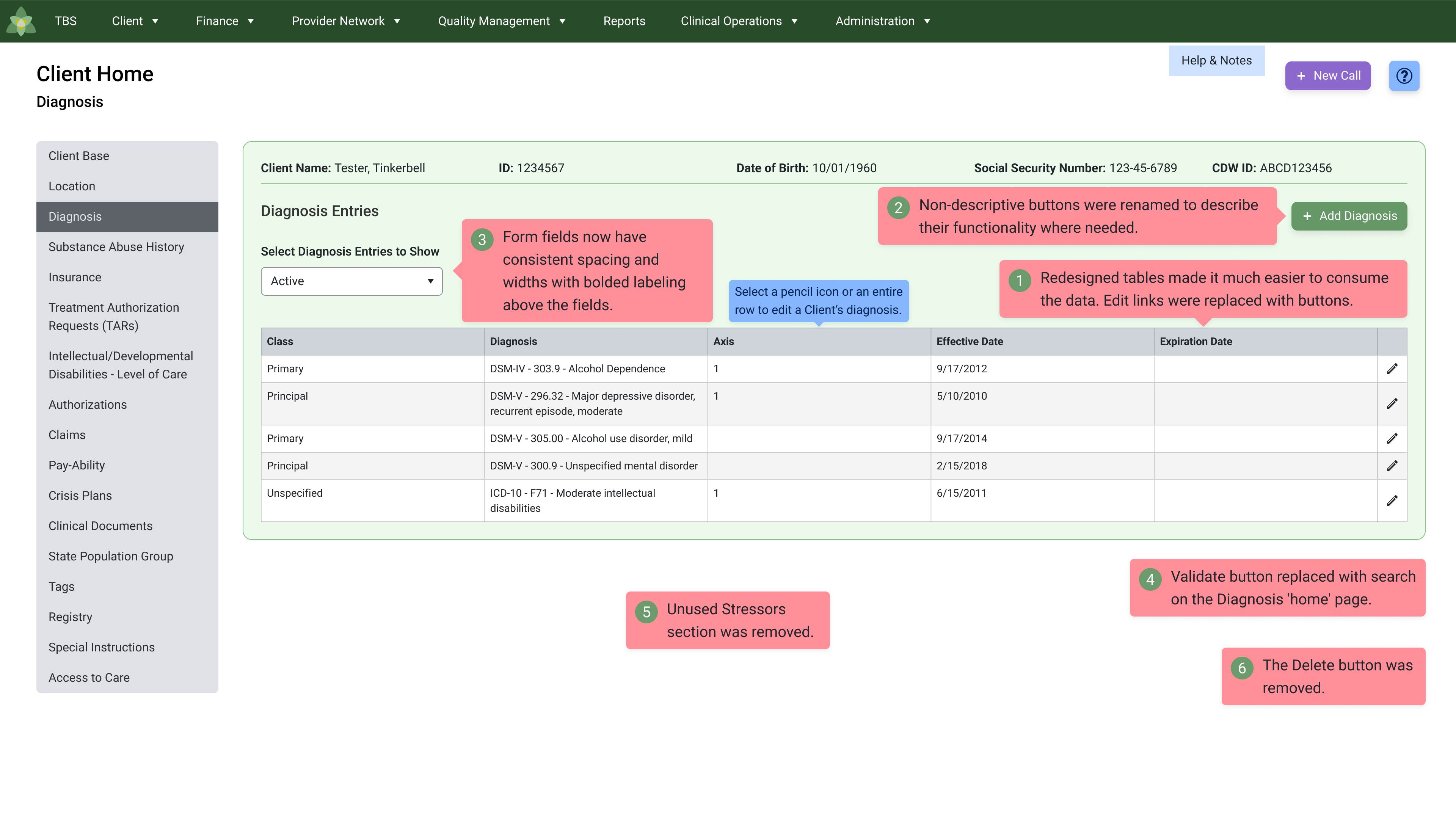
The app section I worked on had a ton of functionality that was distributed across 17 sections (tabs) and many cluttered pages, making navigation difficult due to unclear labels, disorganized sections, and tables with truncated data. The sections covered functions such as editing patient demographics, their location, diagnoses, substance abuse history, insurance, treatment authorizations, claims, crisis plans, clinical documents from doctors, and more. I redesigned these sections by converting the tabbed sections into a structured side menu, removing unused functionality, improving labeling for clarity, and organizing content to better align with the business's daily workflow.
What I Shipped
Some Old and New Comparisons
Diagnosis
Level of Care Eligibility
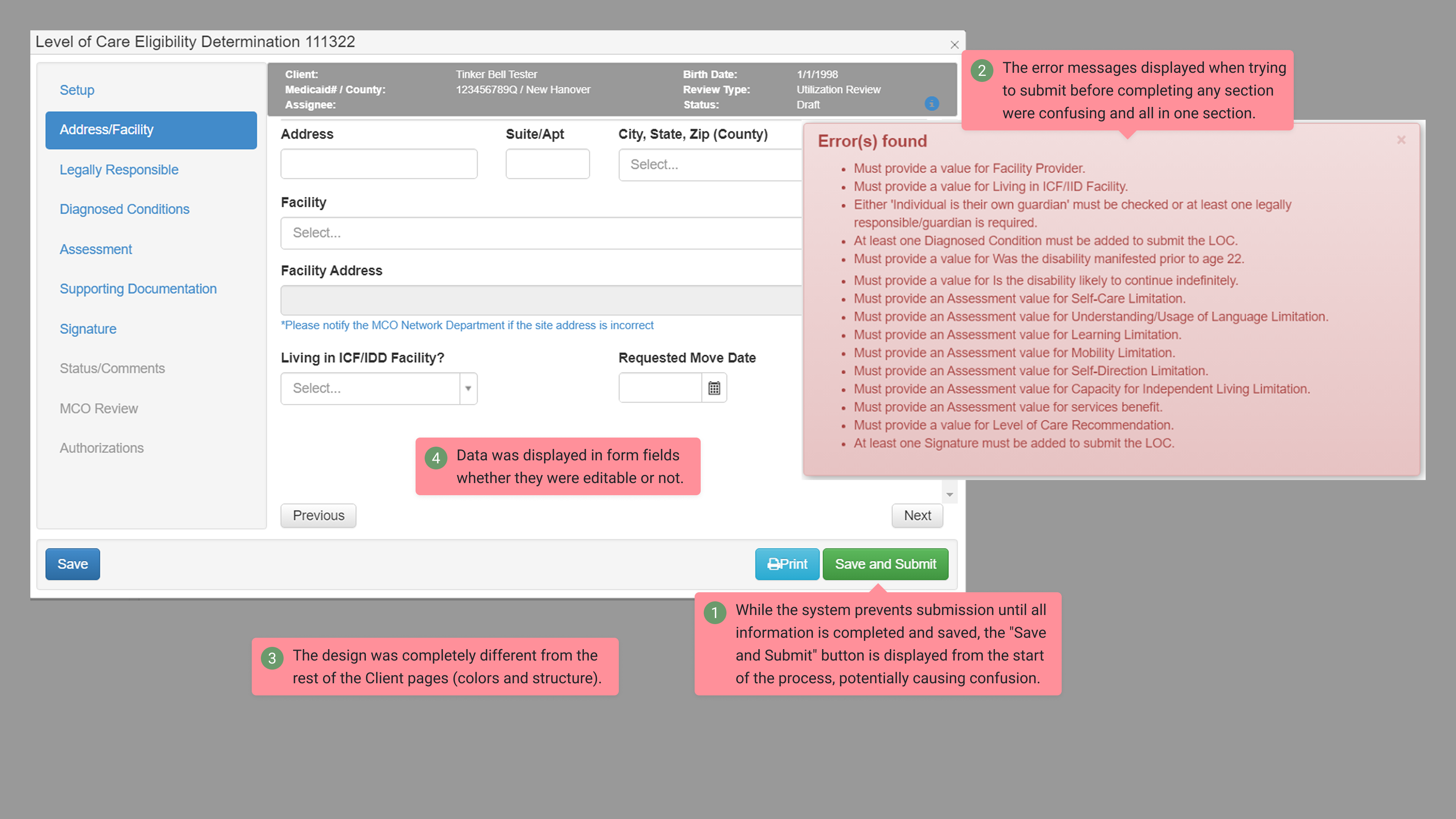
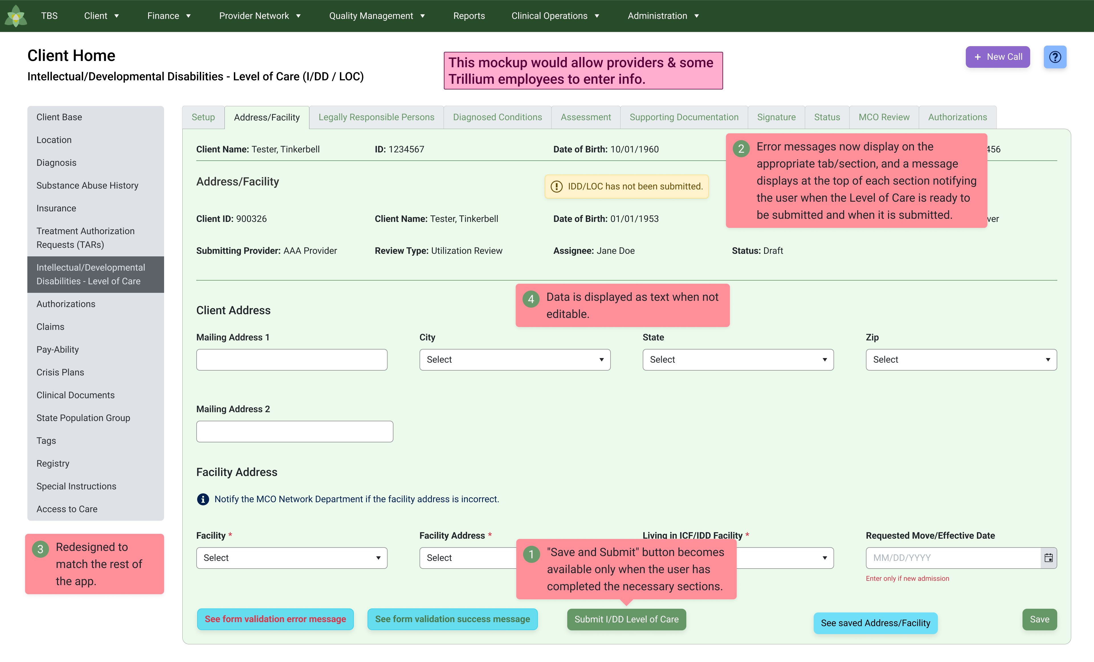
The Level of Care page is integrated with software used by healthcare providers, who complete and submit the forms to Trillium for authorization. The page requires providers to fill out eight sections before submitting the data, then Trillium completes the last two sections to authorize.
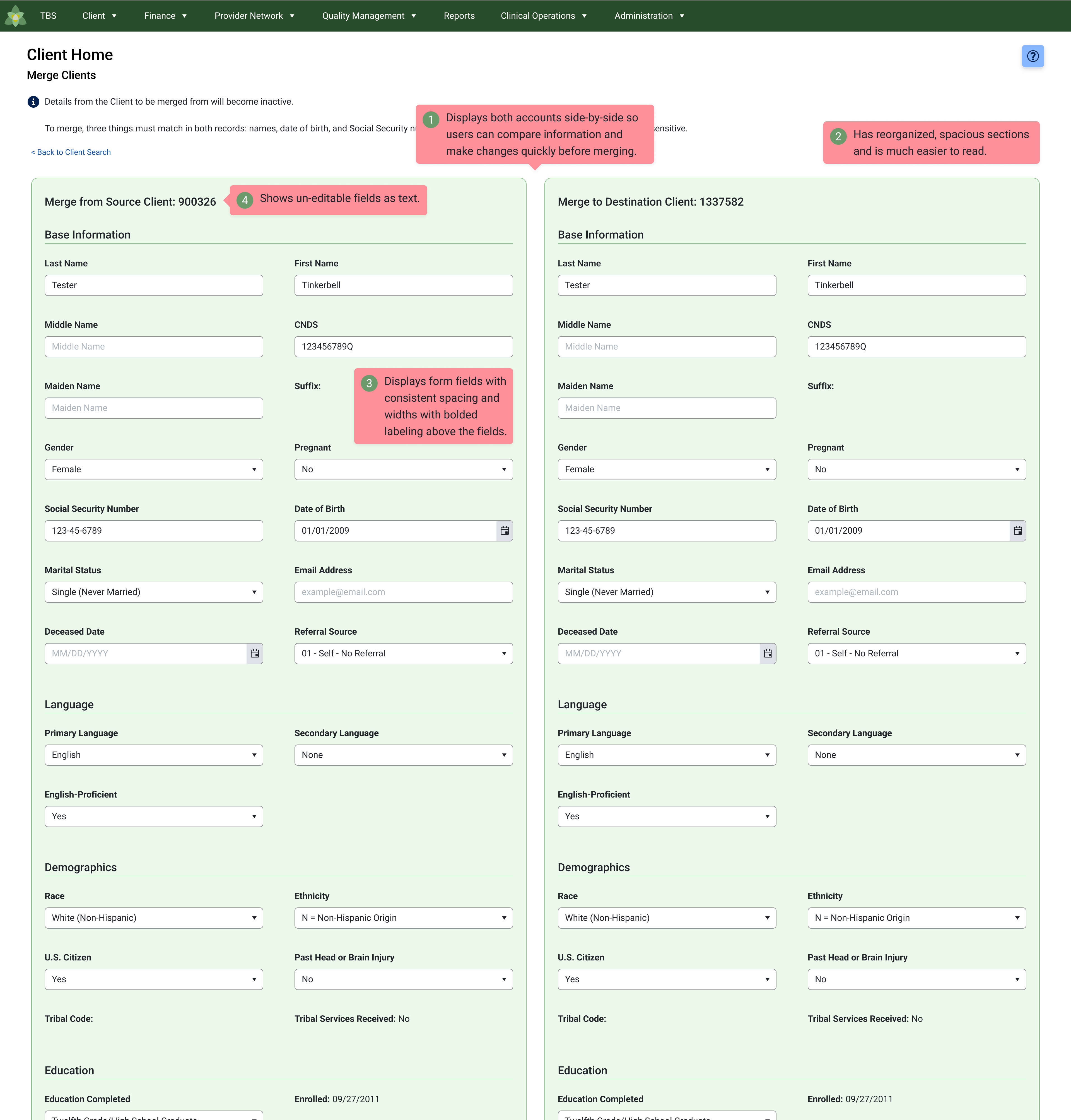
Merge Clients (Merge Duplicate Patient Accounts)
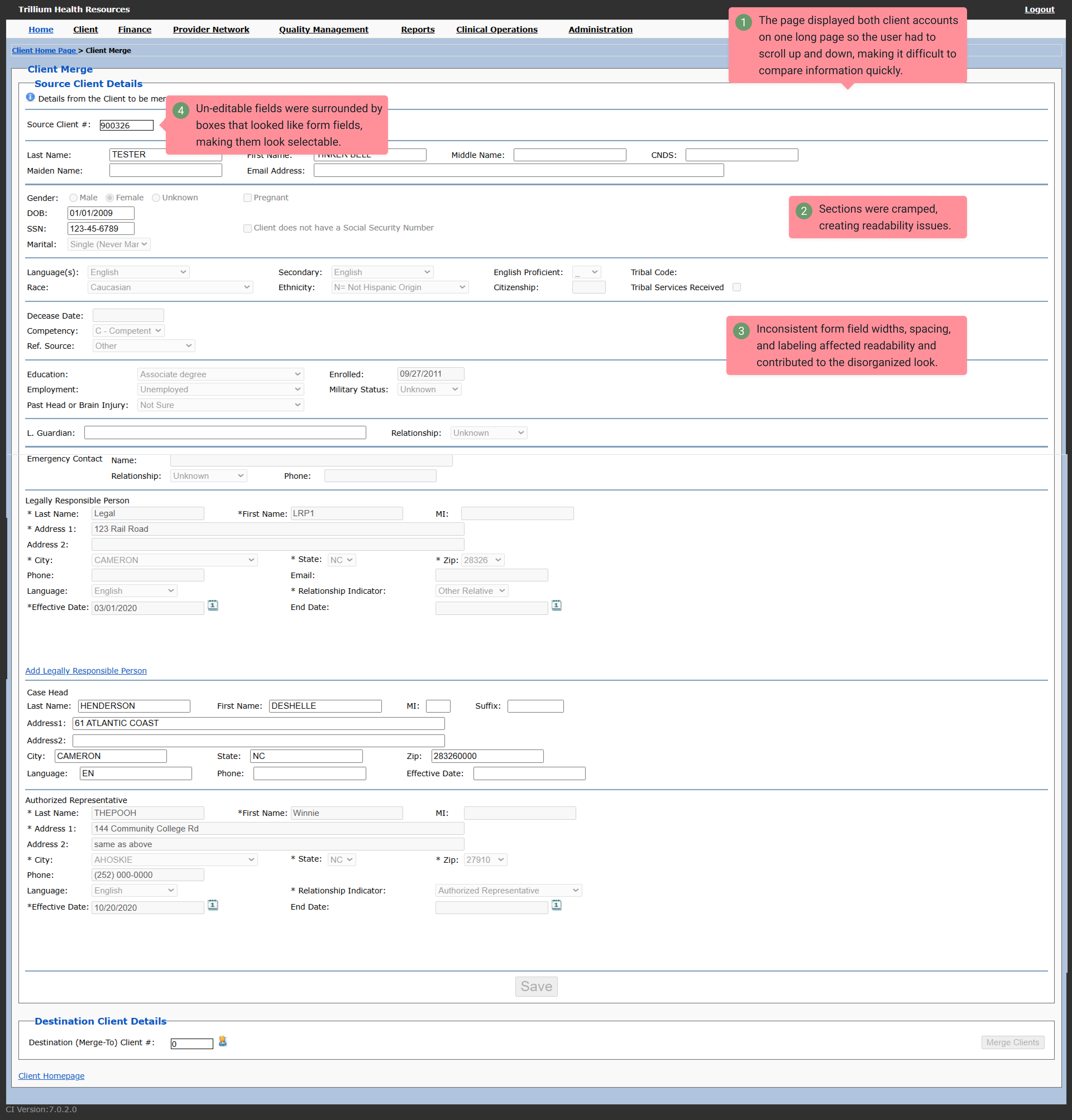
The Merge Clients (Patients) page allows a user to fix duplicate patient account information and merge the accounts.
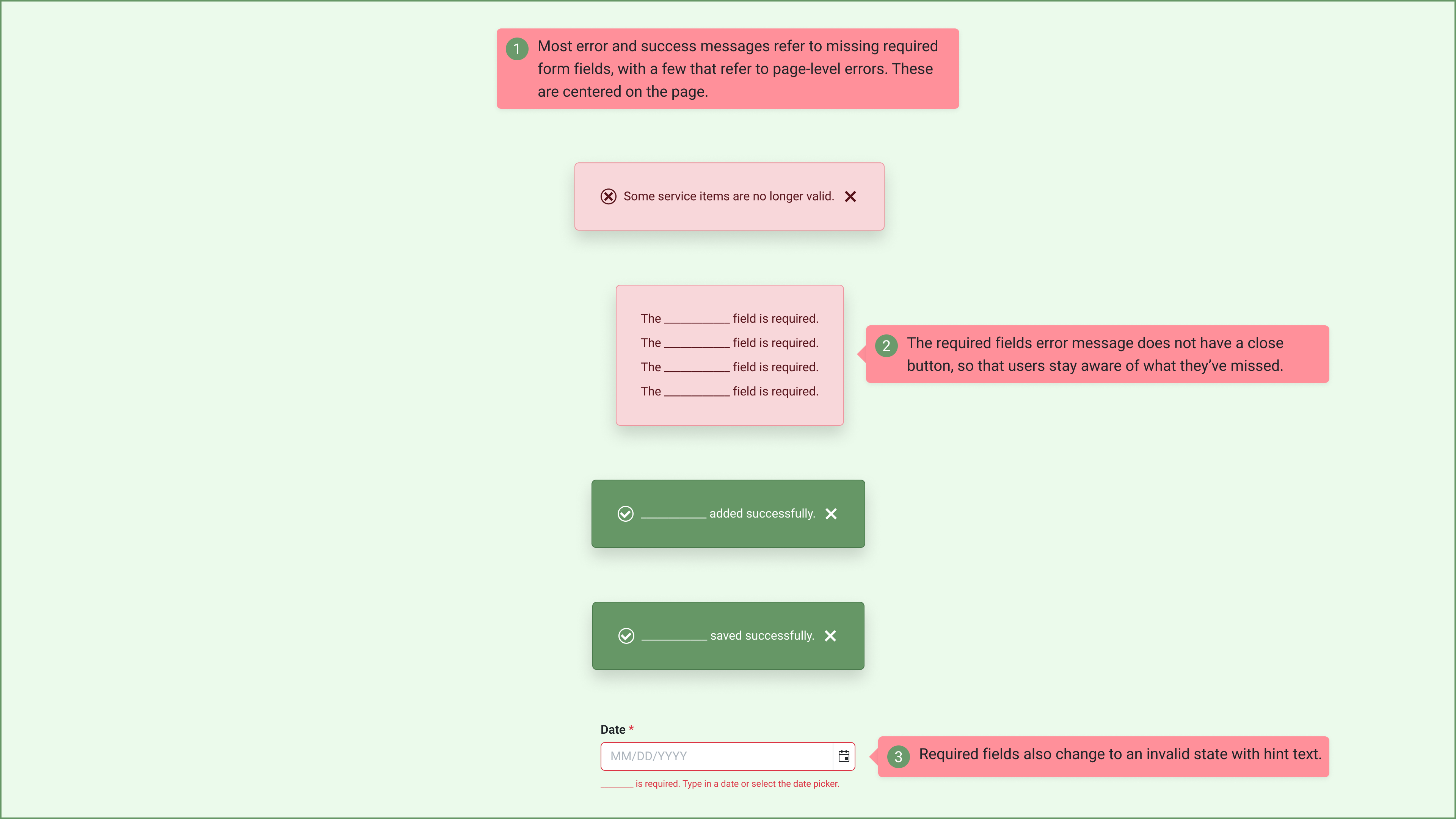
Error Handling
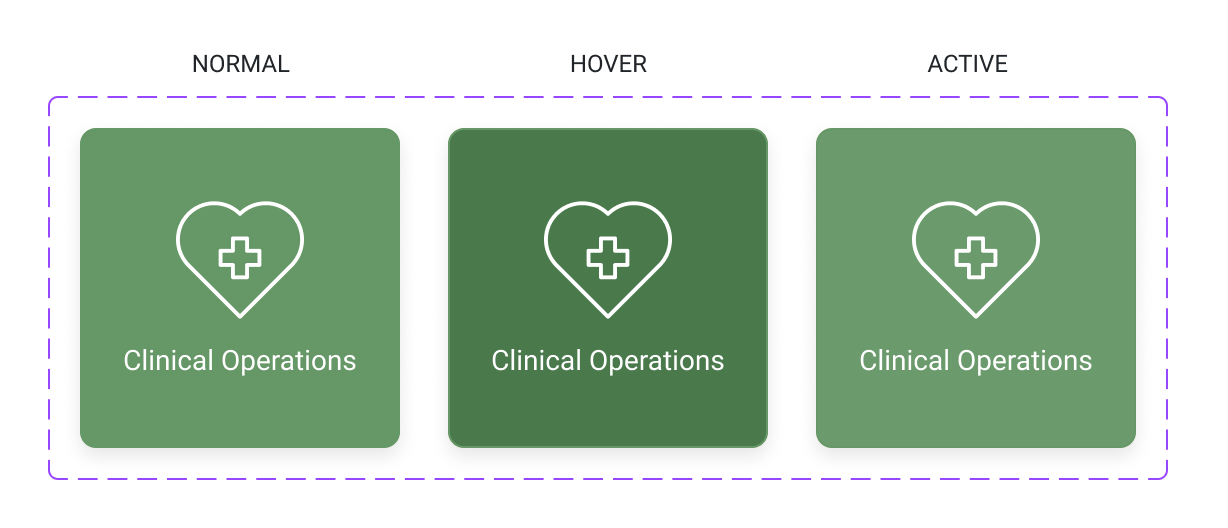
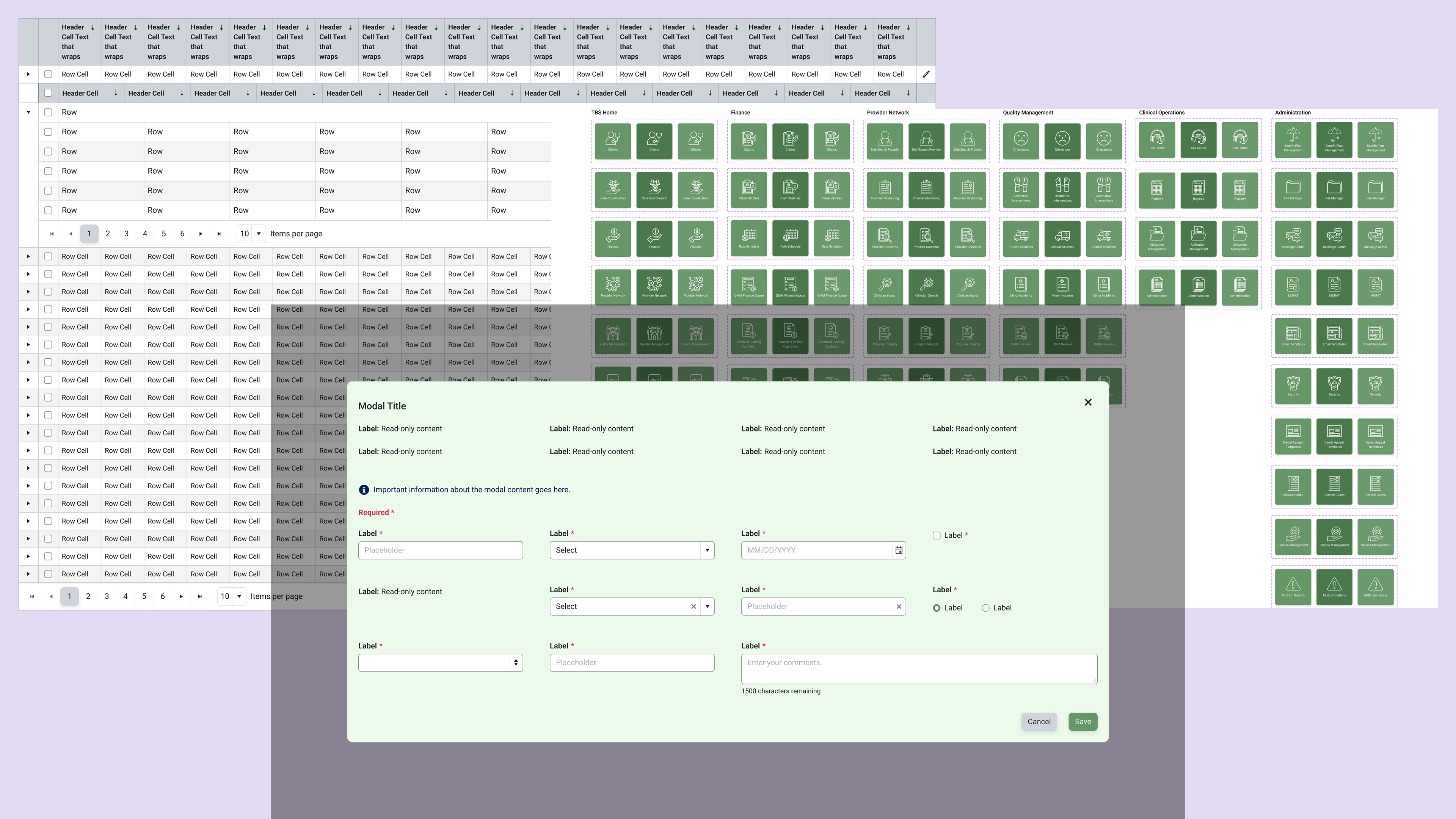
First-level navigation buttons I created and their states
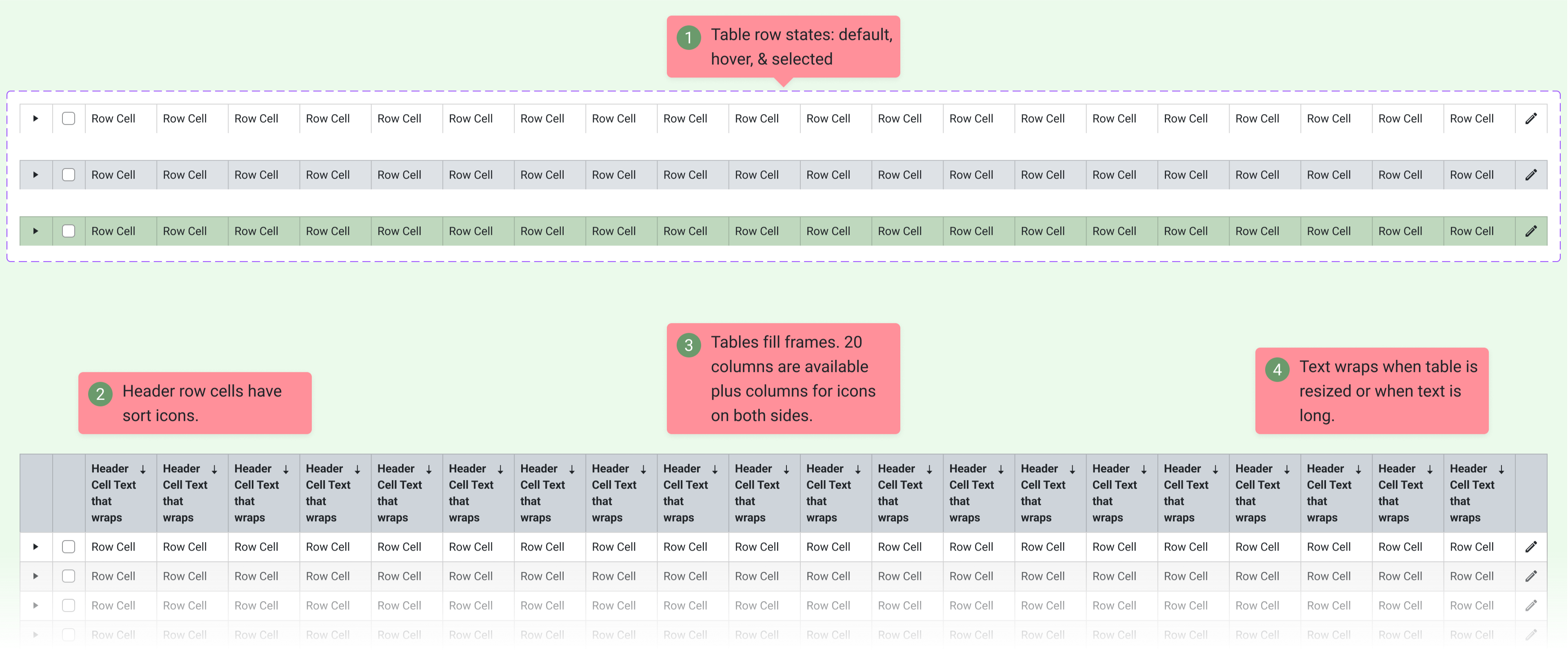
A table from the UI kit I enhanced with its specs
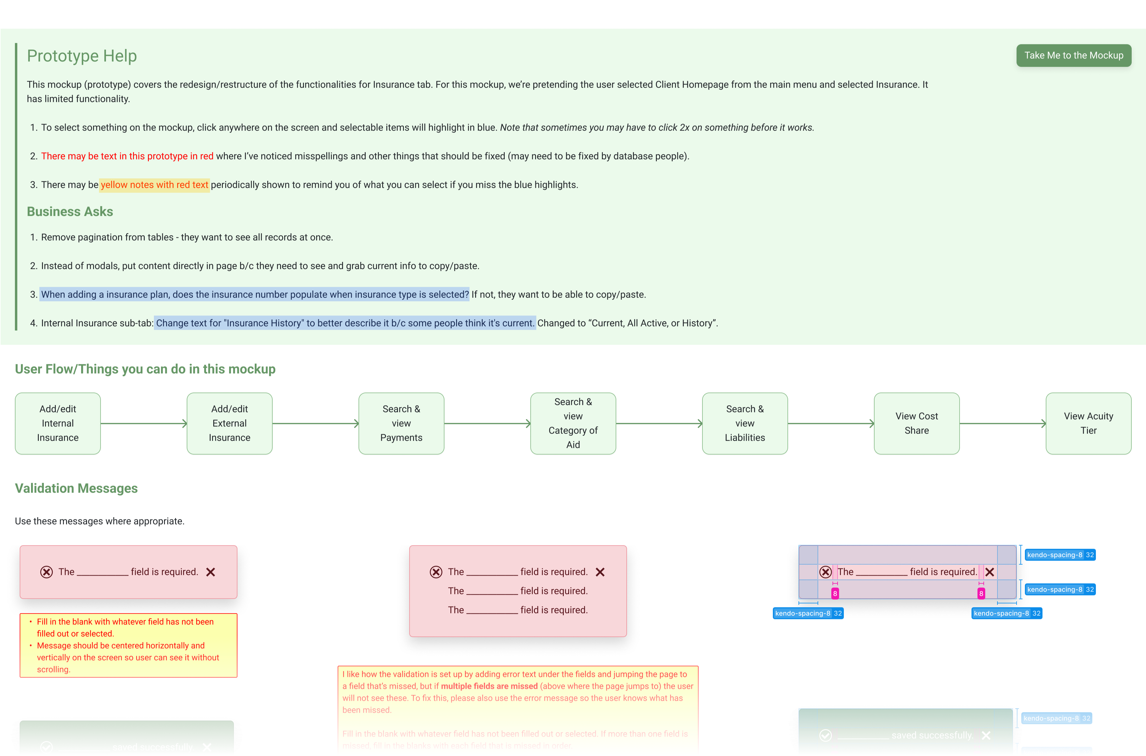
An example of some prototype help for business users and developers
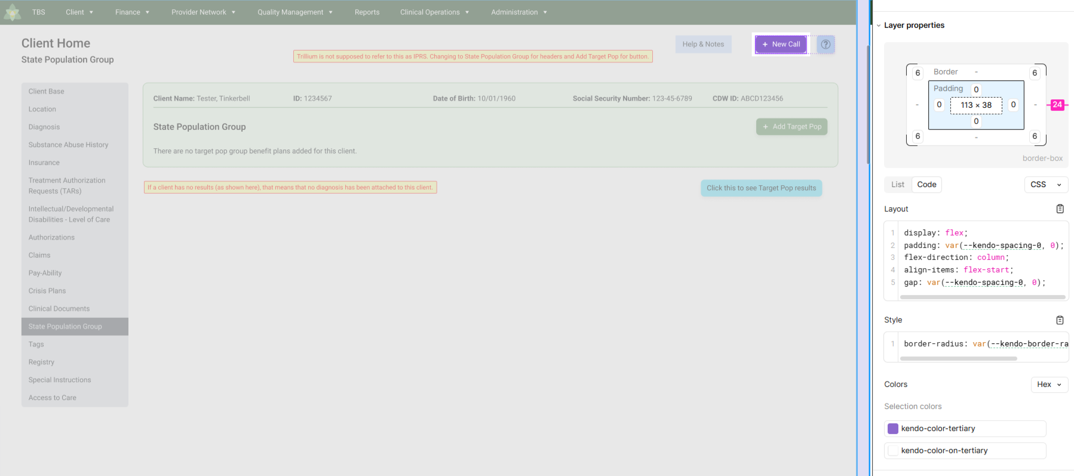
A component in Figma's dev mode
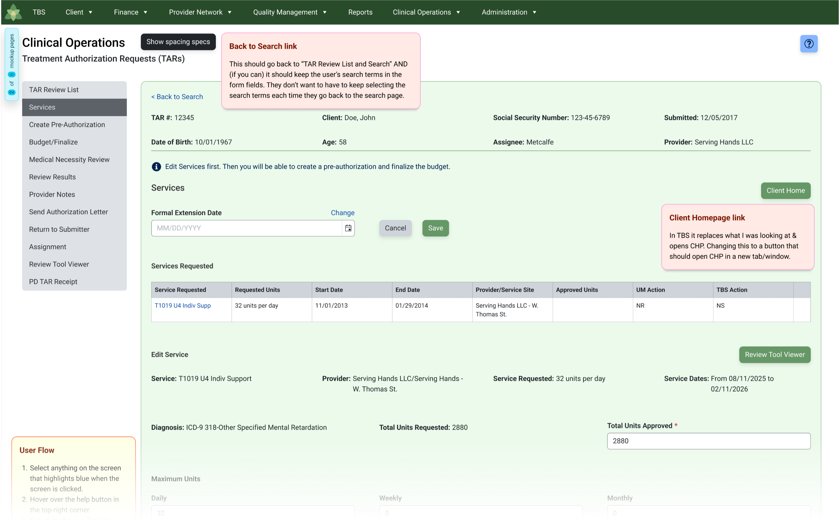
Hand-off notes for developers
Documenting for Clarity and Scalability
I created clear documentation for both the app designs and the design system, ensuring developers and designers had a single source of truth. By capturing guidelines, usage notes, and component specs directly in Figma, I streamlined handoff, reduced miscommunication, and made the system easier to maintain and scale.
.png)
Anatomy of the modal
Validating Builds Through Team Testing
Once developers implemented my designs, a separate QA team tested the builds to ensure accuracy and consistency. Their reviews verified that layouts, components, and interactions matched the specifications, helping us catch issues early and maintain quality across the app.
Results
After testing the redesigned app, users expressed overwhelming satisfaction with the improvements. They found the interface far more intuitive, with streamlined navigation that eliminated previous frustrations they had for years before the redesign. Tasks that once required cumbersome workarounds could now be completed seamlessly, significantly boosting efficiency. The consistent design and clear labeling made the app feel more professional and polished, while the decluttered pages reduced cognitive load, allowing users to focus on their work without distractions. Overall, users reported feeling more confident, less frustrated, and more productive when using the app (cutting 20% of time off their workflow), praising the redesign for making their daily tasks much easier and more efficient.